WHY MOST REBRANDS FAIL IN THE FIRST 5 SECONDS
A rebrand lives or dies in the first impression. Here's what separates the ones that land, and how we build the standard underneath it.
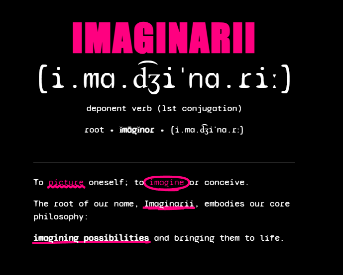
A rebrand is a promise. In those first few seconds a customer isn't reading your mission statement or your feature list. They're reacting to a feeling: does this look like a company that has its act together? That judgment is made fast, it's mostly unconscious, and it's stubborn. Get it wrong and every later touchpoint is spent digging out of a first impression you don't get to retake.
The uncomfortable truth is that the logo is the smallest part of it. What people actually respond to in that opening moment is consistency: type that behaves the same everywhere, color that means something, spacing that feels deliberate, and a voice that sounds like one person wrote it. That consistency doesn't come from a logo. It comes from a standard.
The failure is almost never the logo
When a rebrand lands flat, the post-mortem usually blames the mark. Wrong color, wrong font, too safe, too weird. But go looking and you'll find the real problem: there was never a system behind the identity. A logo got designed, a few slides got approved, and then it hit the real world: a website, an invoice, a slide deck, a storefront, an Instagram grid. With no rules for how the pieces fit together, every team improvised. Six months later the brand looks like five different companies wearing the same hat.
A brand that survives its first five seconds, and every five seconds after, is built on a standard that decides these things once, on purpose, before anything ships. That is the actual work. Here's how we do it.
The principle
A logo is one decision. A brand standard is every decision you would otherwise make a thousand times, made once and written down. The first is what people see. The second is why it still looks right on the thousandth touchpoint.
“Consistency is what people read as confidence. A brand that contradicts itself in five clicks was never going to win the first five seconds.”
– Imaginarii
Built once, applied per client
Here's where the standard earns its keep. Because the brand lives as tokens and components, not as a folder of static exports, applying it to a real build is fast and, more importantly, faithful. The same color and type decisions flow straight into a Next.js site on Vercel. The same voice shows up in the microcopy. The same spacing rules make every page feel like it belongs to the same company, because it does.
For each client we treat this like our own flagship. No handoff theater, no account managers translating between a design team and a build team. The people who set the standard are the people who build on it. And once it's live, we run it: project management you can see, a client portal, and a weekly report on security, accessibility, speed and SEO, so the brand that looked right on day one still looks right, and works right, on day three hundred.
Thinking about a rebrand? Let's make the first five seconds count.
Start a projectBrian McGauley
A field note from the Imaginarii studio.